The Big Portfolio Project Pt. 1
The Concept

My first illustration assignment when I joined Wendy Lynn was to reimagine a pre-existing story in my style. Initially, before realizing the story had to be public domain, I had wanted to do a reimagining of one of my all-time favorite stories growing up, Abi Yo Yo written by Pete Seeger and illustrated by Michael Hayes.
I chose this story not just for the place it has in my heart but because of the unique challenge it would give me. I don’t often give myself the chance or opportunities to draw uniquely “ugly” characters and Abi Yo Yo, to me, was one of the most pivotal artistic staples in my childhood. The pages that included Abi Yo Yo appearing over the horizon against a blood-red sky certainly were one of the most horrifying depictions of doom that I had seen as a child! From the gorgeous illustrations, the design of Abi Yo Yo, and course the song I was head over heels for the idea of tackling this childhood treasure…until I realized it is NOT in the public domain!
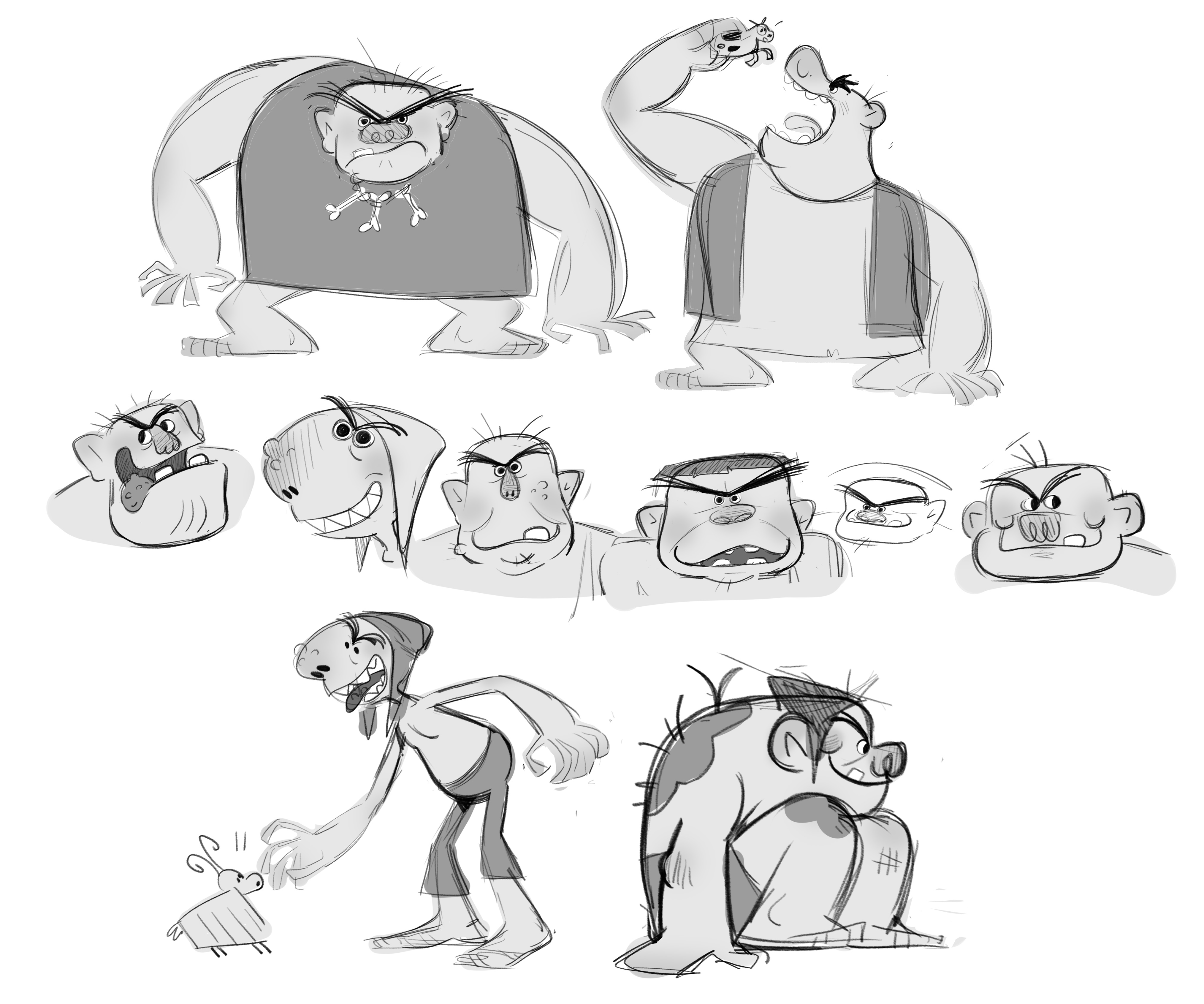
So rather than completely scrapping the idea of creating a troll or giant-esque character I thought about what other stories exist out there that include giants? Jack and the Beanstalk, Jack the Giant Killer, and (the one I brainstormed) Billy Goats Gruff! Unfortunately, this didn’t end up panning out, however, as in the moment I decided I needed to strengthen my portfolio with more illustrations of children. Although, perhaps one day, I would not mind bouncing back and breathing life into this project!
So…what did I end up going with?
During my second week, I came up with two potential portfolio project ideas that would not only be a fun challenge for me as an artist but would be loads and loads of fun. The first idea I presented to my agent was….
✦ The Jungle Book by Rudyard Kipling
The Jungle Book by Rudyard Kipling is one of the most iconic books ever written, and I have admittedly not read it in a very, very long time. It has the perfect blend of its own challenges: a child character, a bear, a panther, wolves, a tiger, a snake, and dense jungle landscapes. This project would have certainly tested my ability to utilize color and come up with interesting compositions.
When it came to character designs, my favorite part, I really wanted to explore each character's personality without relying on the 1967 film for reference, which admittedly was quite difficult considering that the film is mostly everyone’s point of reference for the story.
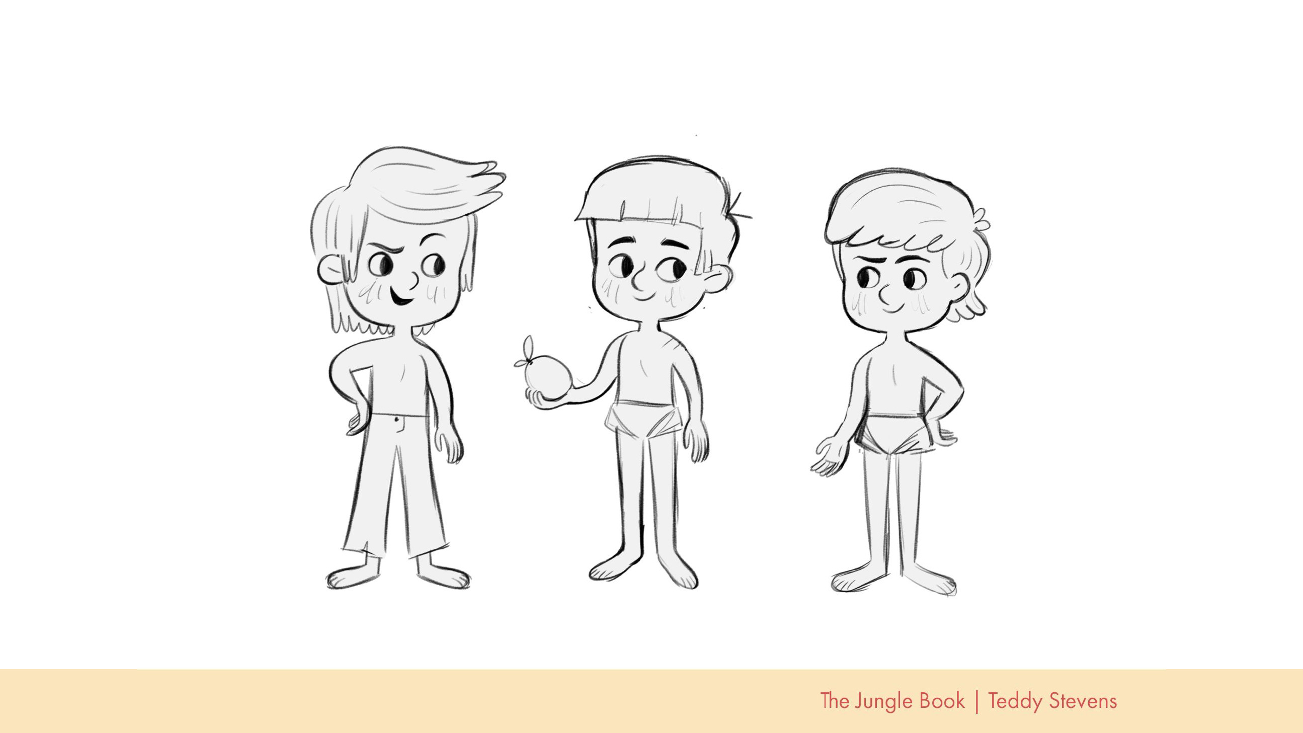
For Mowgli, I wanted to keep him friendly yet mischievous so I focused on using rounded edges for his hair, facial features, and limbs but still allowed myself to play with sharp edges in his hair and eyes with option 2. If I were to revisit this project (wink wink) I would personally go with 1 with tweaks to the length of his hair, and perhaps substituting his trousers with the bottoms used in 2 and 3.
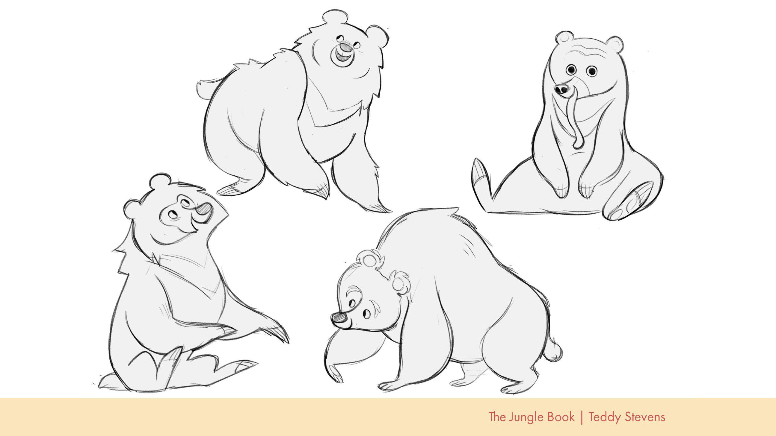
When it came to designing Baloo it was determining what kind of bear he should be. In the original book, Baloo is described as a Sloth bear, a bear that is indigenous to India, Sri Lanka, and Nepal. In the ‘67 film, though still a sloth bear according to the wiki, I always thought of him as a brown or black bear due to his overall shape and appearance. And most recently in the Disney ‘live-action’ adaption, though still described as a sloth bear, I thought he most resembled a brown bear. So with all that in mind, I took a crack at designing a handful of Baloo’s taking inspiration from the sloth bear, a sun bear, and of course, a brown bear.
I’m quite fond of how the bottom two came out. I think the first one on the left has a playful presence about him that I love whereas the second option on the right feels far more gentle and kind. Maybe a cross between the two would be a great middle-ground if I were to revisit.
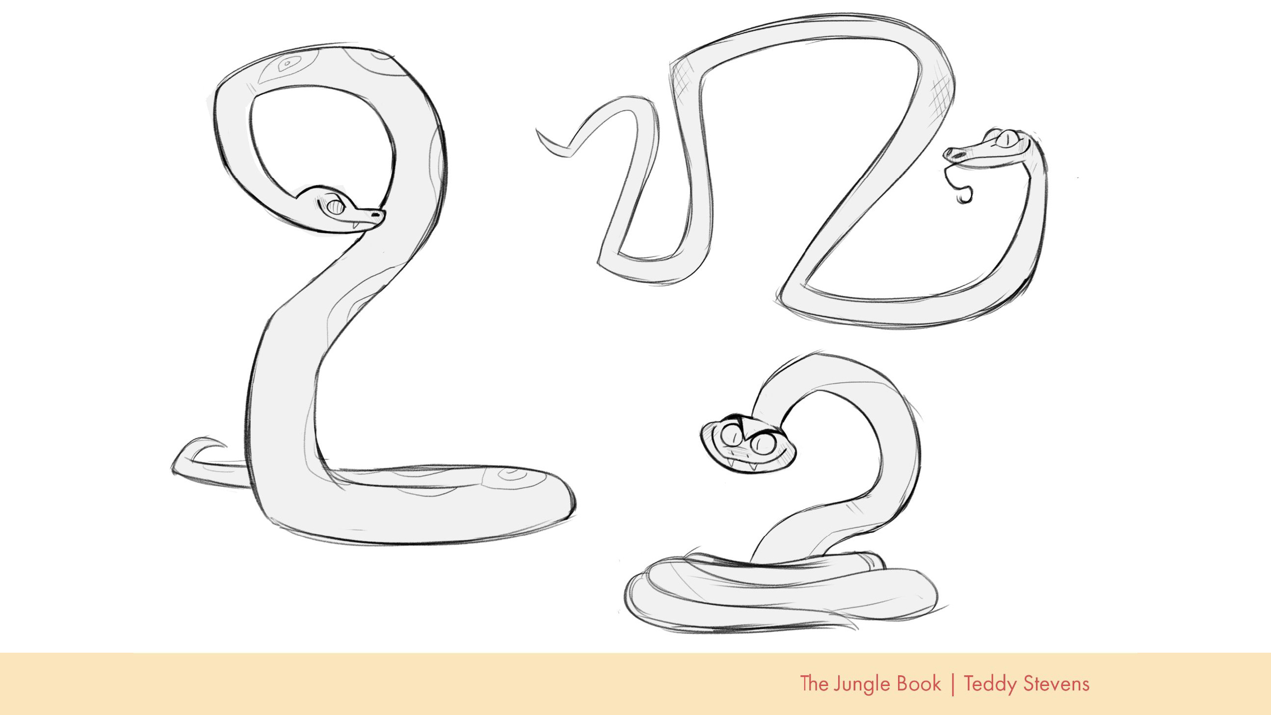
Kaa was an interesting challenge for me! I don’t often draw snakes, but I have a big place in my heart for these scaley critters. This also happens to be where the Disney influence got me. In the original novel, Kaa is portrayed as a friend and ally of Mowgli’s whereas in the Disney films, Kaa is more of a bumbling antagonist. As I look at these sketches I wish I had remembered that detail and made the expressions a bit more friendly and inviting, but I love the top-right design. The way that Kaas’s body has odd curves scratches an itch in my brain. If I were to go back and redevelop this character, I’d take the eyes as scales motif from the left and slap it onto the design on the top right.
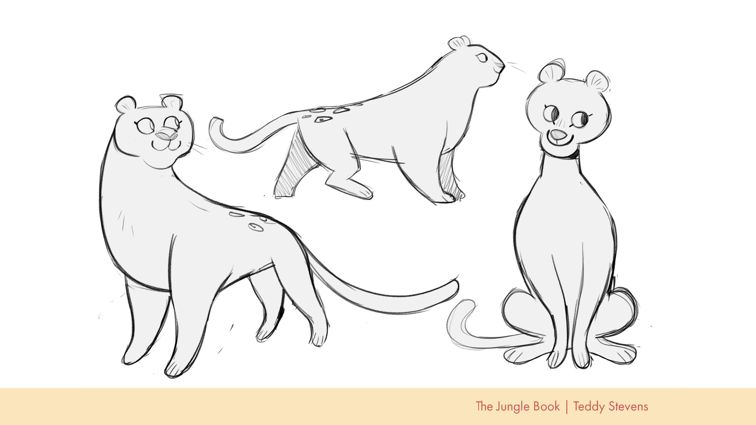
Bagheera was a lot of fun and also a bit of a headscratcher to develop. When I think of big cats my automatic thought is big teeth, sharp edges, and claws. But Bagheera, as described by Kipling was a supporter of Mowgli, a teacher/mentor, and an older sibling-like figure. With that in mind, I went about designing Bagheera with round and square shapes with little to no triangles at all. I wanted to push the idea that this character is very kind and loving but is also strong and sturdy. With that all being said, I adore the design on the left. I feel as if it really captures the Bagheera that I wanted to represent.
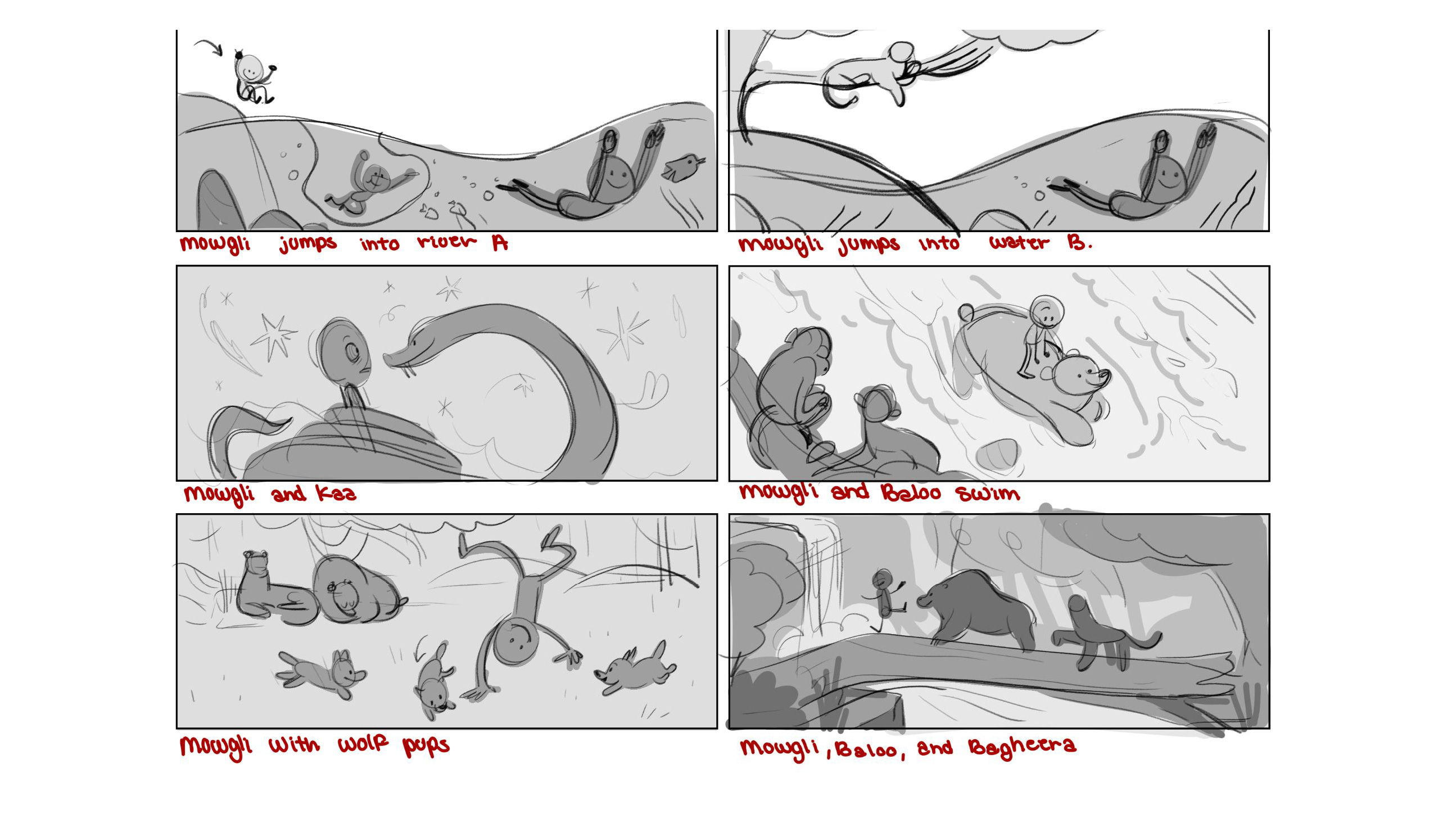
When it came to developing the thumbnails, I leaned heavily on my storyboarding for animation skills. The first two of Mowgli jumping into the water are my absolute favorite and I think the Mowgli and Baloo going for a swim would be a great opportunity to play with color and perspective if tweaked to account for the gutter. Overall, if I were to go back to this project I’d like to explore this world a bit more with a much more book-accurate Kaa!
✦ Hansel and Gretel by The Grimm Brothers
If there is one thing true about me it’s that I love drawing food. So. Much. As I’m writing this I’m currently drawing a pasta-related piece for no other reason other than I love pasta and I think it’s cute.
Most of the projects in my portfolio, before my update, were food-related in one way or another. So when my agent suggested doing Hansel and Gretel to ham up the food-related scenes I was all over it.
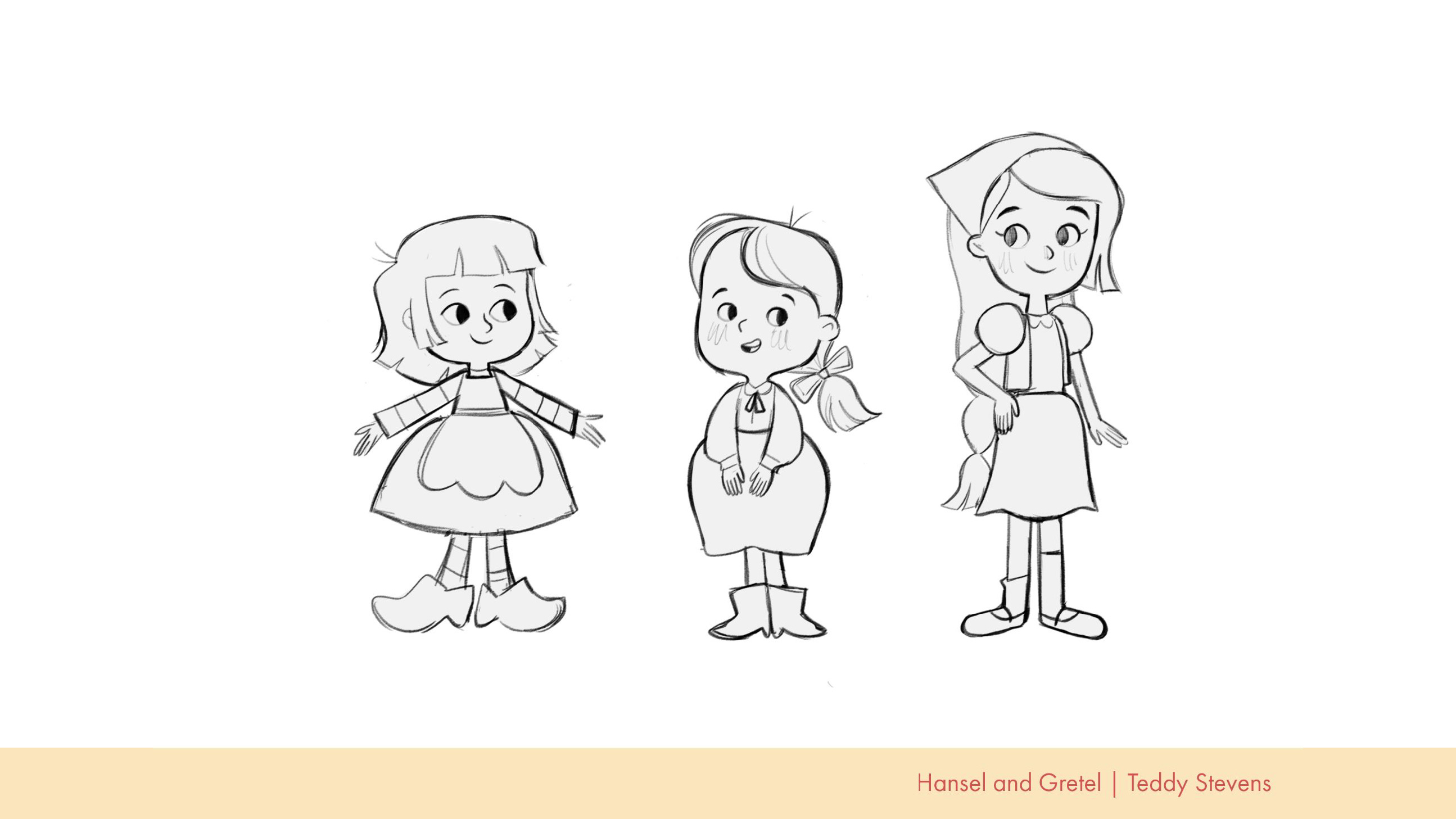
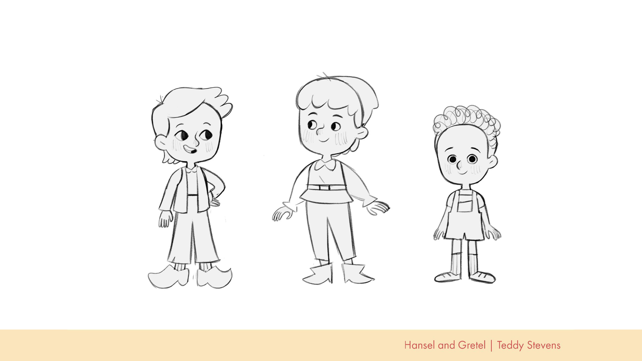
When designing Gretel I first approached her as a younger sibling, a possible twin, and an older sister. I really wanted to emphasize the idea of her kindness with the roundness of her dress, big ol’ clog-like shoes, and choppy unkempt hair. I actually have a lot of love for all three of these designs for different reasons, they could all potentially make a really great Gretel!
When tackling Hansel, I used Gretel as a blueprint for the two to make sense when standing together. And like Gretel, I wanted to explore a possible older Hansel, a twin Hansel, and a younger Hansel.
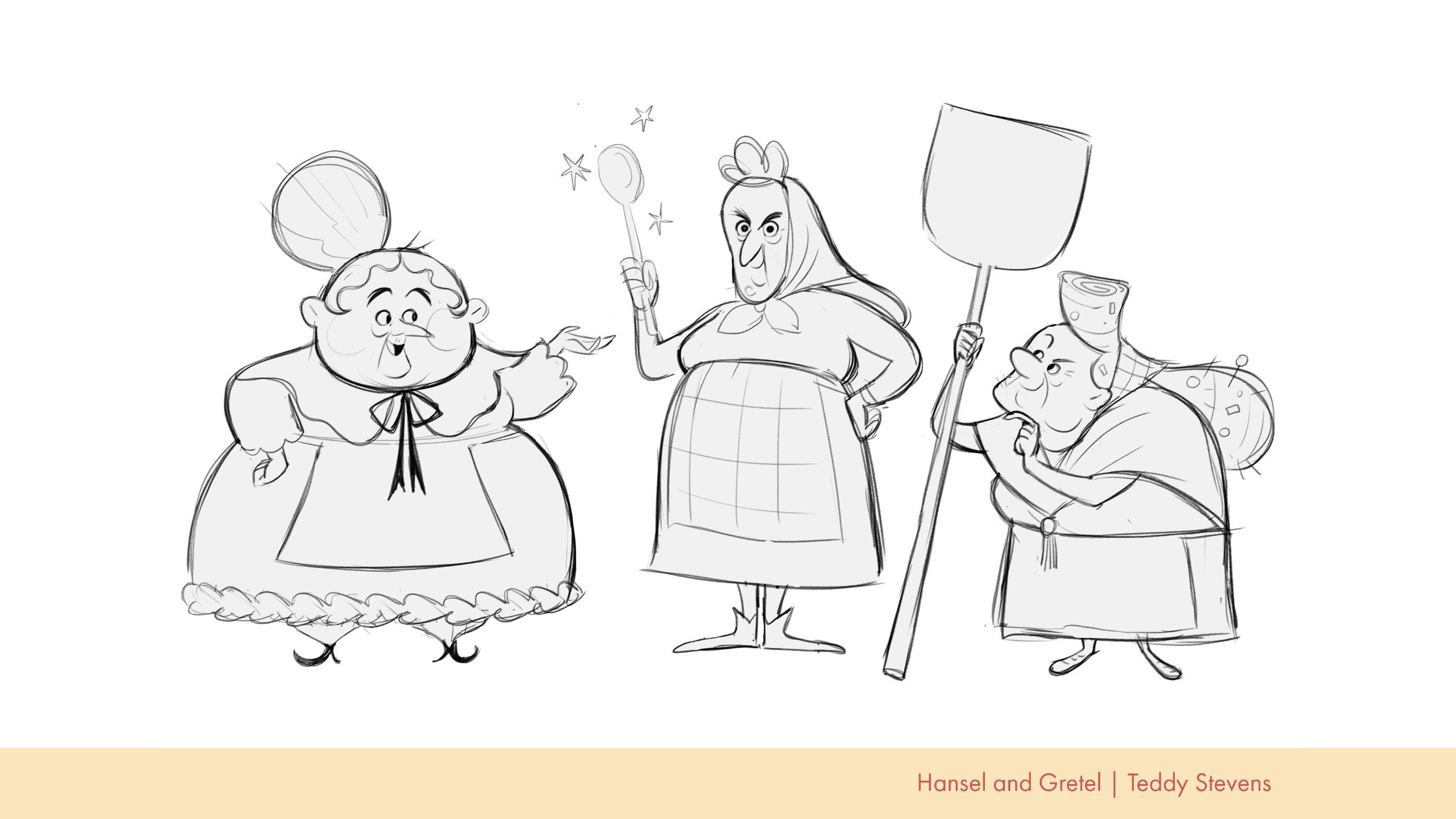
The witch on the other hand, was my absolute, without a doubt, favorite character to design. My first approach was heavily inspired by the Teen Titans villain character “Mother Mae-Eye”, a character who is round and soft with little to no points or edges on her. Though with my rendition of this character, I still want there to be additional hints to her wicked intentions with a pointed nose, pointed hair framing her face, pointed fingers, shoes, and bowtie.
With the second design, I was aiming for a bit less magical and a little more casual with a simple old woman.
For the third, though I still enjoy the second, I wanted to lean back into what I liked so much about Mother Mae Eye and my first design. With this attempt, I went back to rounded edges, with a strudel-like curl in her not-quite pompadour, and bits of candy stuck in her hair.
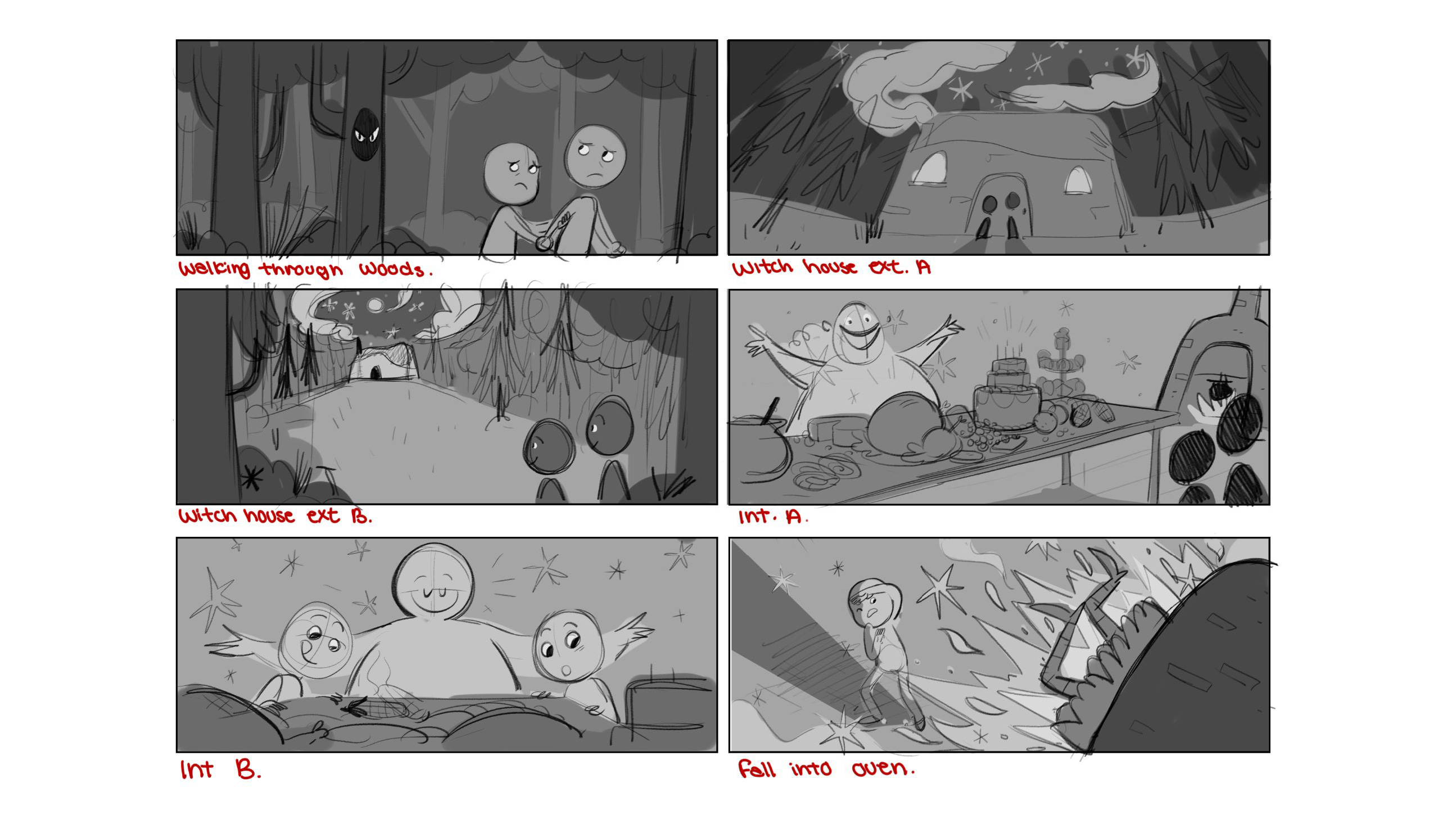
For the thumbnails, like the jungle book, I leaned a bit more heavily into my animation knowledge to make these story beats feel a bit more cinematic. However, with the gutter taken into consideration, some of these simply wouldn’t work haha. BUT! The witch falling into the oven was an absolute blast to board and turned out to be one of my favorite thumbnails out of the boards I’ve done during this phase of development.
✦ In Conclusion
What did I end up going with to develop into my final? Well with a lot of thought and consideration from both myself and my agent, we decided that the winner was…..
HANSEL AND GRETEL!
If you want to see the development of that project with all the behind-the-scenes goodness be sure to subscribe to my newsletter. My next newsletters will be all about developing Hansel and Gretel’s tweaks in character design, color choices, and backgrounds! Stay tuned and I’ll see you next time!